As one of the leading innovators in fast casual 2.0, Tender Greens established itself over a decade ago as a trend setter in restaurant design, branding, and operations.
But recently, it became clear that the brand needed a refresh. And leaders realized Tender Greens needed the Band-Aid treatment; as much as it might sting, it was time to pull it back all at once.
It also didn’t hurt that Danny Meyer shared a similar notion.
“When he suggests, we listen,” says Christina Wong, director of public relations and brand expression at the fast casual.
Tender Greens, which has 24 locations in California and is prepping for national expansion, was the first outside business Meyer’s Union Square Hospitality—founder of Shake Shack—group invested in. The chain was founded in 2006 by Erik Oberholtzer, David Dressler, and Matt Lyman. Meyer’s investment came in 2015.
A lot has changed in two years, let alone 11. Yet Tender Greens hasn’t, at least not visually. The original logo, created by Oberholtzer’s brother, sticks an arugula leaf between “Tender” and “Greens.” The green and brown overtones, Wong says, initially served the company well.
But, in time, the fast casual landscape has changed. Health-driven concepts have flooded the market. In fact, so much so that Tender Green’s image was actually becoming a detractor.
“When you look at our logo, especially our original logo, a lot of people are like, ‘Oh, I’m not eating there, that’s a vegetarian restaurant. That’s a vegan restaurant.’ That’s really not the case,” Wong says. “There are so many missed opportunities for people to enjoy Tender Greens and the really amazing food that we have simply because there was a leaf in our logo.”
Meyer’s suggestion also included the services of a branding genius. Paula Scher, a partner at Pentagram, is responsible for developing Shake Shack’s logo and imagery, a project she famously did pro bono back when the chain was simply a buzzing local burger joint.
Scher traveled to the West Coast and explored Tender Greens. The goal, Wong says, was for Scher to pinpoint what separates the fast casual in an increasingly saturated category.
“People look at our name and look at our logo and say, ‘It’s a salad restaurant.’ And we’re definitely not a salad restaurant,” Wong says. “The rebrand is really an opportunity to reintroduce ourselves to the world.”
Wong says Tender Greens expects to double in size in the next five years, and are about to invade the East Coast, making this the ideal time to rethink “our brand, our design, everything.”
“The way I describe it is we’re the same company and brand that we’ve always been—the same owners, the same chefs, the same food—we just have better style now,” she says.
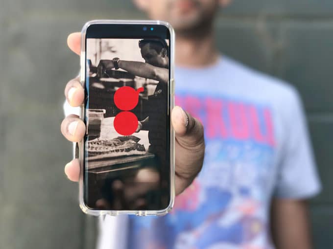
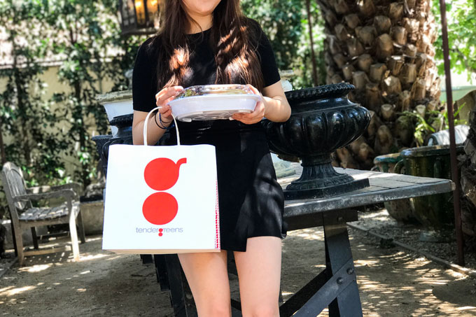
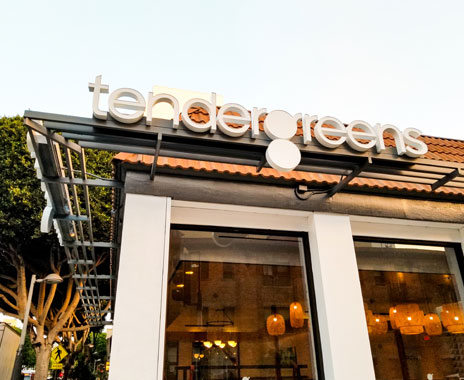
The holistic rebranding was unveiled August 9. Starting with the logo, Tender Greens’ mark is now a tomato-red “g” formed by two stacked circles. The top circle signifies a pan ready to cook and the bottom is a plate ready to serve. The red, which replaced the green, is meant to harness “the vibrancy of a roasted red pepper or sun-ripened heirloom tomato,” the company says.
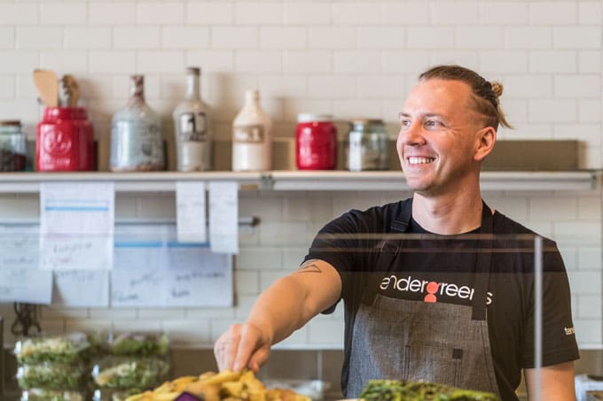
“The rebrand is really driven by defining Tender Greens as a chef’s kitchen,” Wong says. “And we have chefs that run every single restaurant and that plate and that ‘g’ is up to our chefs and us to fill.”
Next came store design. The modern look is fresh and clean, and incorporates natural, light-colored woods with a black, white, and gray color palette featuring pops of red, teal, and yellow. It aims to highlight Tender Greens’ open kitchen and showcase its chefs.
Some unifying elements include high-contrast black-and-white tile by Cement Tile Shop, Cedar and Moss globe pendant lighting, and reclaimed woods by Terra Mai.
Tender Greens took the rebrand behind the scenes as well, revamping its mobile and website offerings. With Olo, the brand created an improved online ordering platform that spotlights each unit’s unique chef. A new app, set to roll out in September, will feature mobile ordering, payment, and a rewards program—something Wong says guests have clamored for—developed by Punchh.
A key feature online will be the site’s dedication to visual. It will now feature the specials, which change twice daily, as images, not just text, like it has been in the past.
“With the rise of Instagram and photography and imagery we really eat with our eyes first,” Wong says. “We need to take advantage of that. Instagram really gave us a way for our chefs to share what they’re making twice a day, every day. And it dynamically changes on our website. Before people were always following us on Instagram to see what our specials were. But this way it’s one place on our website and you can see exactly what you want. You can see who the chef is and what they’re making.”
Uniforms and packaging followed. Executive chefs now don custom-designed Hedley & Bennett denim aprons with red apron strings, “g” tag, and monogrammed names. Black and gray T-shirts with pops of color and custom Manduka headbands were also added.
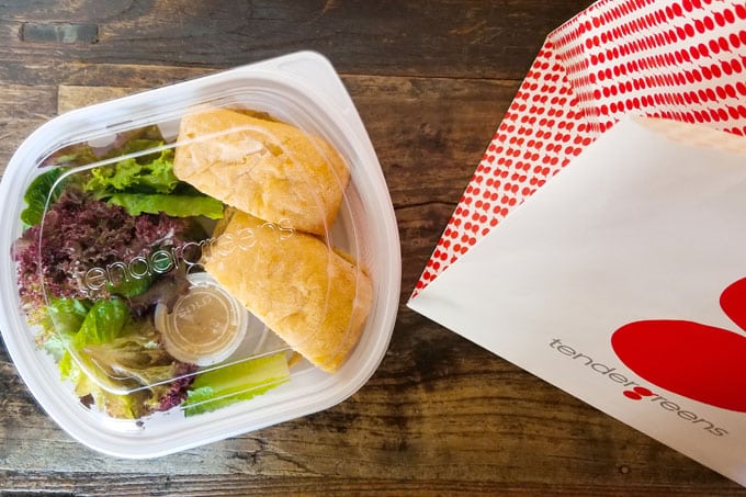
The to-go packaging is now all white and made from 20 percent recycled plastic with a design created in-house to mirror Tender Greens’ Steelite plates, and also includes the “g” mark stamped at the bottom. Additionally, the units are switching to recyclable paper bags. Tender Greens printed all new menus as well.
This expansive process has been in the works for about a year and a half, Wong says. Scher handed the team some designs and explained her process.
“Tender Greens is a true chef’s kitchen, and our goal in conveying this modern, upbeat fine casual experience was to make it a real tribute to the chef’s cooking,” Scher says in a statement. “We were inspired to create a logotype showing an overhead view of a pan in silhouette. We created custom typography and use the ‘g’ to help communicate the daily specials, often through the use of photographs. The strong modern graphics, color treatment and signature ‘g’ will soon make Tender Greens even more recognizable to all of its customers.”
When Scher delivered the final package, Wong says the team made a list of everything that needed to be changed out.
“Everything in the stores, online, digital, every single item that would have to be created and designed and produced,” she says. “Then we kind of worked backward and assigned a timeline. We said, ‘OK, if we designed it by this time how much time would it take for this to happen?’ Then we kind of worked on a launch date from there.”
For Wong, the unveiling moment was both thrilling and a little scary. Not so much from the consumer angle but from an in-store one. They kept the process closely guarded until July and arranged “roadshows” for all of the brand’s managers to come and check out the new look.
“The most rewarding moment was when they all looked at it and their reactions were great,” Wong says. “They loved it. And every single person looked at us and said, ‘What took you so long?'”