For Michael Heyne, the name of his fast casual restaurant was kind of like a bad haircut. Until he fixed it, nobody was willing to be honest. “We knew we had made the right choice,” Heyne says, “when people started coming up and saying, ‘I always wanted to tell you, your old name sucked.'”
On Friday, Heyne’s Verts Mediterranean Grill, 19-unit concept founded in 2011, will unveil an extensive rebranding that touches the entire concept. And yes, that includes a name change.
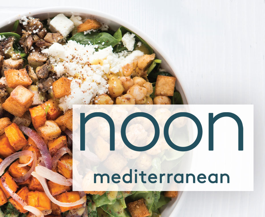
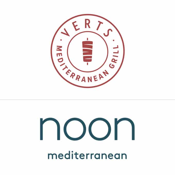
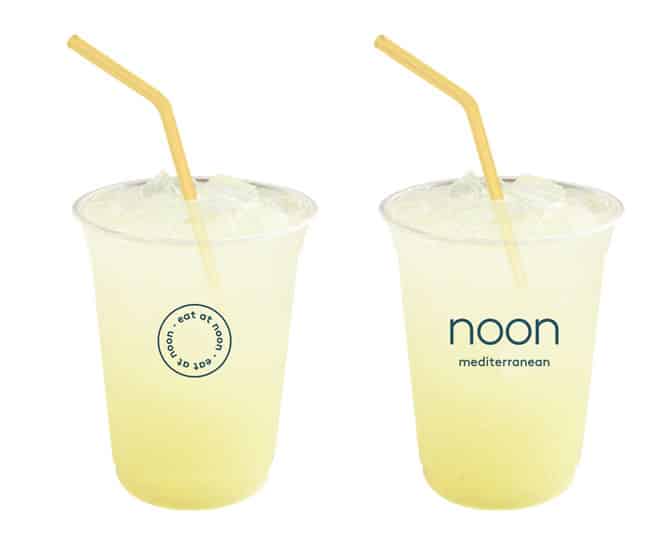
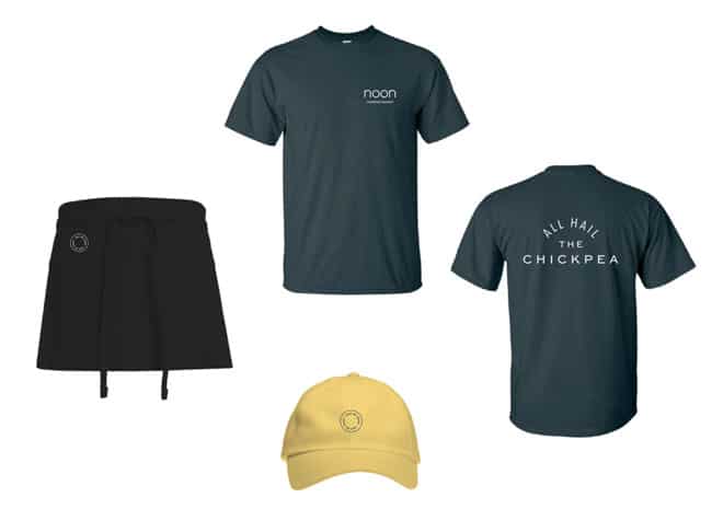
Verts, which started as VertsKebap, is switching to Noon Mediterranean. The original name was a reference to döner kebap, a Mediterranean dish of grilled meats found in European countries. But there were issues, Heyne says.
For starters, it was hard to pronounce. Its meaning—Vert also translates to green in French—was pretty much lost on customers. In fact, Heyne says it had a negative impact, since it felt industrial and didn’t conjure up any thoughts of food or the culinary angle the brand worked so hard to develop. It drifted even further away as the fast casual expanded its menu to include falafel, salads, rice bowls, hummus, and more.
“We learned over time as our expectations grew, as our food and our team grew, as everything grew, that the name was actually limiting us,” Heyne says.
Heyne and the restaurant’s co-founder, Dominik Stein, recognized it was the ideal time to change. The Austin, Texas-born concept moved its office to New York City over the summer and is set to open its second Big Apple outpost in December. “This was the best chance to do this before we start growing on a national level. Of course a rebrand is complex. It’s already complex the way it is right now. But if we’re going to be in 20 different cities, 15 different cities, it gets much harder,” Heyne says. “Also we want to expand and grow and build our culture on what we consider aesthetically pleasing and fitting to where we’re headed.”
The team reached out to Gin Lane, an agency that helped develop fast casual icon Sweetgreen. At first, Gin Lane was tasked with rebranding the restaurant from the inside out, taking a deep look at its color scheme, its signage, and how it presented to guests. But Heyne says they kept pestering the company to admit what they already knew: the name needed a facelift, too. “They didn’t really want to tell us right away, but we asked over and over again,” Heyne says. “Eventually they said, ‘Yes, you need to change that as well.'”
Why Noon Mediterranean? It’s another name with two meanings. Only this time, Heyne says guests will be able to easily connect the dots. Firstly, it’s a representation of lunch and the middle of the day—a place Noon thrives. It also directly relates to food in an easy-to-pin way. Noon even means bread in Farsi.
The concept also serves the dinner crowd, but Heyne says the ambiguity won’t be an issue. It worked for Shake Shack, which also sells burgers in addition to shakes, after all.
“The old name, it was not witty and millennial,” Heyne says. “This one is. It was difficult. All the emotions you experience are loaded onto your old name. But we’re also not afraid of changing. We didn’t start a restaurant company to give it one name and keep it. We started a restaurant company because of our approach to cooking, to culture, to people. And that old name was just not the right one.”
Noon has been working on this, in some manner, for about three years. Over the past 12 months, the company has put pretty much everything else on hold so the heavy lifting could be completed.
Beyond the main idea, Heyne says there are some 300 sub-projects that go along with the rebranding. The color scheme is switching from a red-based design to a combination of green, blue, and yellow. It’s a darker, satin yellow and a warm, inviting emerald.
A plus for the name Noon is that it didn’t require any additional logo design. The name itself, in lowercase letters, does the trick.
There’s a spreadsheet for every restaurant changing over. Logos, menus, mission statements on the wall, murals, posters, restroom signs, non-smoking signs, opening hours on the front—every graphic material needs to be swapped. Then, operationally, handbooks, training programs, core mission statements, and values, all of those materials need to be reworked and realigned.
“The people part is what is going to continue on,” Heyne says. “Those physical things happen beforehand.”
Noon also worked with CORE, an architecture and design firm out of Washington, D.C., to develop a new interior prototype. This design will be featured in every new opening after the upcoming New York City unit. Noon will redecorate and selectivity remodel old restaurants as well.
The revamped look has a mid-century feel to it with a focus on lighter, brighter materials. Distinct shapes and materials will help it stand out, Heyne says. This includes high-quality woods, décor, and importantly, a double-counter service model that can ease some of the lunch rush burden.
Heyne feely admits much of this was a necessary evolution. The founders have a background in management consulting and investment banking. The concept had all the operational and digital tools to thrive right out of the gate. The units are fully paperless. The training programs are iPad based. They launched online ordering in August 2016. But the branding, he says, simply wasn’t competitive.
Growing in Texas, a lower-volume market than Manhattan, allowed the restaurant to figure things out, he says.
“We did other things well while our brand was awkward. And now it’s getting interesting for us,” Heyne says. “We are more efficient than any other company in the marketplace right now at operating. And now we’re very excited because we have a brand that can create emotions as well. We can showcase the fun part—our brand and our food. We’re very excited about the next years.”