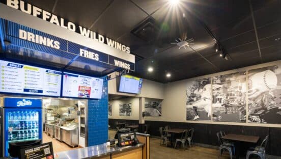
Changes brought on by COVID-19 have forced restaurants to stay in near-constant communication with their customers. With the lockdown situation changing by the day, customers need to stay informed of new hours, new policies, where to stand, how to enter your store, if you offer takeout, and whether or not you’re even open.
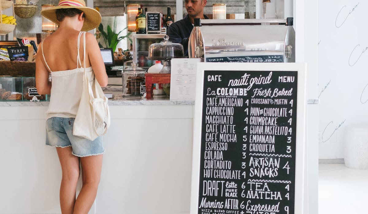
More and more, restaurants have leaned upon sandwich boards, or sidewalk signage, to communicate this information from a distance. Sandwich boards can be set up outside your storefront or in large-traffic areas, keeping customers up-to-date and attracting passerby without them having to enter your restaurant or stand too close to the sign.
“Sandwich boards have been huge for us,” says Eric Peterson, owner of the North Country Restaurant Group. “We use them for a huge variety of messaging, from directing customers to outdoor seating and proper entrances, to letting them know that we’re open and require masks.”
But how do design a sandwich board? What works, and what doesn’t on sidewalk signage?
Lyra Juinio, senior designer at MustHaveMenus, a menu template service for restaurants, shared her thoughts on the topic. She has designed hundreds of sandwich board templates for restaurants to customize and use. She shared the top four lessons she’s learned, along with examples.
Large type. Simple messaging.
The No. 1 mistake restaurants make with their sandwich boards is writing out long messages with small text. If a customer needs to walk up to your sign and then spend time reading through it, you’ve missed the point of having a sandwich board.
“Here’s a simple test to determine whether your sandwich board design works,” Juinio says. “If you can’t read and understand it as you drive by in a car at 10 mph, you need to go back to the drawing board. Then simplify and enlarge.”
Use eye-catching colors
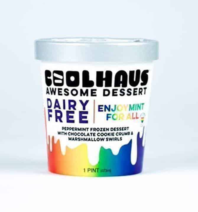
Sandwich boards aren’t the place to experiment with subtle color combinations. The goal is to make your message clear at a glance. Use bold, poppy colors and sharp contrasts to ensure your message stands out. The same goes for imagery. Choose photos that showcase your food and restaurant with a quick glimpse. Don’t assume customers will take the time to decipher some intricate photo.
“We’re naturally inclined to stop and pay attention when we see bold reds and yellows. Those two colors work really well, especially against a white background,” Junio says.
Double check both sides
Many restaurants use sandwich boards as means to direct customers through their store. If you design your sign inserts with arrows, make sure you reverse the arrow on the second insert. If you keep it identical to the first insert, it will actually point the opposite direction when you put it in the stand. Customers will get an entirely different message on where to head depending on which side they approach the sandwich board from.
“We see this all the time with customer designs,” Juinio says. “They don’t think through how the arrow will look on both sides of the board. Every design element needs to be considered from both angles.”
Bigger QR codes
More and more, restaurants are turning to QR codes to promote touchless ordering at their store. In a similar vein to text, restaurants often display their QR codes too small on their sidewalk signage. Customers should not have to stand a foot away from the sign to get an accurate scan.
“QR codes should be 4–6”, at a minimum,” Juinio says. “If you can go bigger, that’s even better. You to make it as easy as possible to scan.”
[image source_ID=”128068″]
Mark Plumlee is the senior editor for MustHaveMenus. He writes about restaurant marketing and design.

