category:
The “Wow” Factor

1st place:
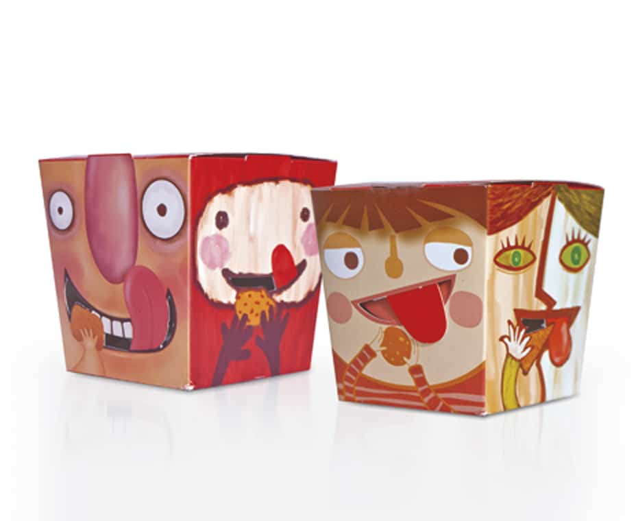
KFC Snack Box
Yum Restaurant Co.
The entry:
The box design is not just for functional utility, but also branding and emotional connection with target groups, helping to position KFC as a brand for teens. KFC Thailand has been trying to connect to teens, a segment that rarely considers KFC as the “Brand for Me.” However, this segment also comes with the potential of high visit frequency and snack consumption.
Yum’s packaging strategy is based on the concept of being a buddy with teens. Thai teens are fun, love exploring, and are very relationship-centric. They also take advantage of a variety of moods and occasions to enjoy snacks, which are mainly composed of bite-sized local favorites. There are a variety of fun experiences, unique stories, and occasions that can happen with the snack, but the packaging still has to reflect the delicious nature of the food item.
Judge’s comment:
In years past, it was not uncommon for the winner of this category to be the biggest box in the judging room. That’s not surprising, really—by definition, the “wow factor” is the thing that really catches your eye. But this year it is quite the opposite, as literally the smallest box gives the biggest “wow.” It is, in fact, partly the dainty size that appeals so much, but the graphics play a big role, too: They’re just so darned cute. No other word for it.
2nd place:
McDonald’s Jewelry Burger Box, Packaging Technology Integrated Solutions, a Division of HAVI Global Solutions
3nd place:
Color Changing Spoons and Mood Straws with Message, GO-2 Products
