McDonald’s CEO Chris Kempczinski believes the post-lockdown world will be driven by trust. He said in April that early COVID-19 learnings suggested customers would seek known brands and familiar routines. They’ll put their safety into the hands of restaurants they understand and feel comfortable with.
“You saw it in the at-home occasion, center of the store, familiar brands in grocery really benefited as people were staying home,” he said. “I think that same dynamic is going to be at play as people start to come out looking for familiar [restaurant] brands.”
So where does marketing come into play? Brand equity and messaging is critical right now. It’s the key to achieving everything Kempczinski referenced. There’s only so far restaurants can go on past affinity alone. Given all the changes at hand and how dynamic the situation remains, restaurant marketers will need to adjust and readjust to maintain that bridge of trust. And to continue to find ways to express those core traits across to guests, as well as inspire communication in a socially distant world.
Tyler Brooks, creative director of Turner Duckworth, chatted with QSR about the challenge of restaurant branding in a COVID-19 world. What does it take to make a quick-service chain’s brand unmistakable?
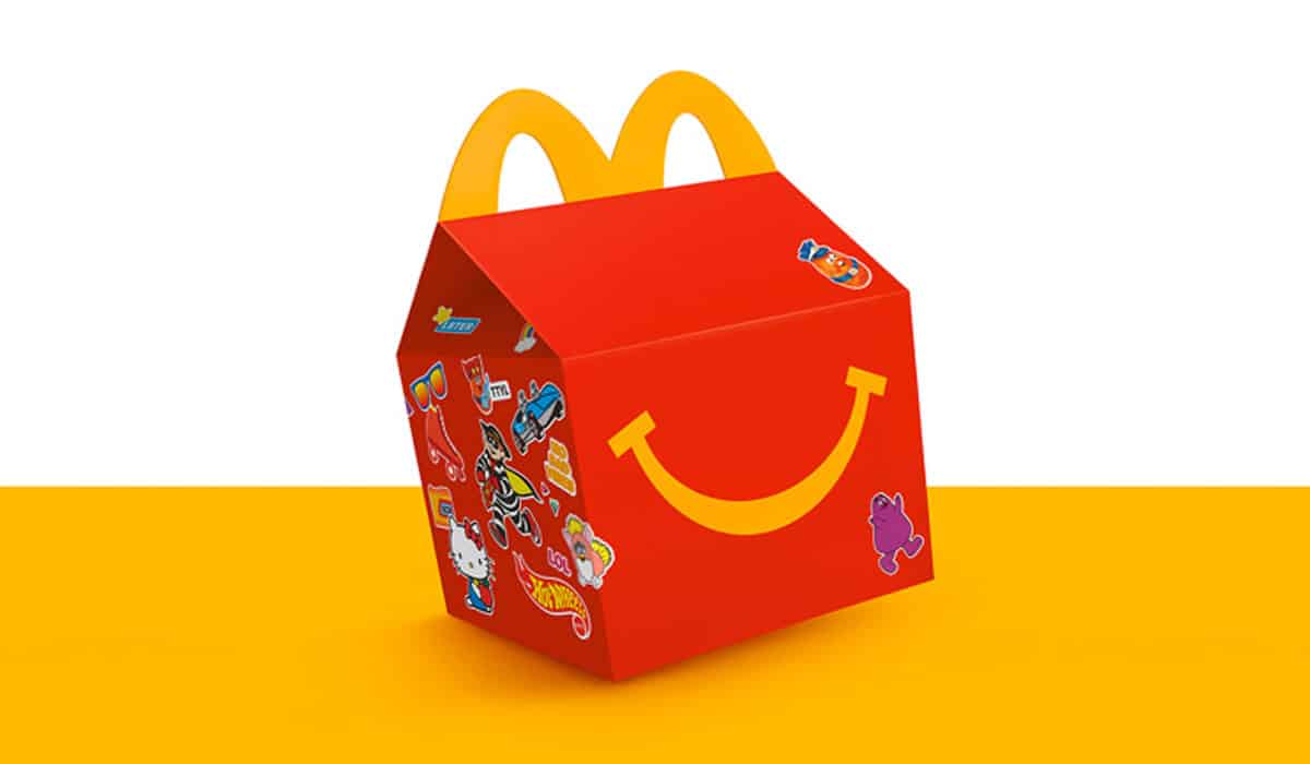
Turner Duckworth is the firm behind many globally recognized logos for chains, including McDonald’s, Burger King, Little Caesars, and Tim Hortons. The company also recently relaunched McDonald’s new Happy Meal design.
Firstly, talk about your role at Turner Duckworth and the company’s overall mission and experience in the fast-food space.
I’m a creative director in our San Francisco studio, where my team and I are responsible for all things McDonald’s. Beyond that, my experience includes everything from albums for Metallica to the redesign of Little Caesars.
We have studios in San Francisco, London, and New York. We’ve created global design systems and visual assets for a wide-range of clients—Coca-Cola, Amazon, Samsung, Miller-Coors, to name a few, and quick-service restaurant brands like Subway, Burger King, Tim Hortons, Little Caesars, and, most recently, McDonald’s.
Turner Duckworth started out in package design, though we quickly discovered that our approach for creating iconic packaging seamlessly transitioned more broadly into the world of visual identity. Design systems should be holistic and connected, not siloed.
Our mantra is to “Love the Unmistakable.” This means discovering and celebrating what makes a brand truly special and unique. Simplicity and minimalism is not enough. Brands need their own character and personality. We’re not in the business of creating short-lived campaigns. We strive to create long-lasting, impactful and distinctive visual assets—logos, graphic devices, iconic packaging—for our clients. An example we often reference is the Amazon logo, which we designed almost 20 years ago. Their business has grown exponentially (to say the least!), but the logo has stayed the same.
Pivoting to today’s unprecedented times, consumer behavior has shown brand value to be more important than ever. In other terms, people are seeking out the restaurants they trust. Is this something you’ve seen as well?
Definitely. We’re all looking for some semblance of normalcy. Enjoying a favorite meal from a familiar restaurant gives us a bit of that. Not to mention the challenges that many other pastimes—movies, sports events, concerts, and more—are still facing for the foreseeable future.
How can restaurants really dig into this right now? What are some ways restaurant brands can really emphasize their core traits? And what are some messages they must get across today?
Your company is likely made up of many different teams with different responsibilities and different priorities. But your brand can’t look that way for consumers. It’s got to be packaged seamlessly and cohesively. Personal rather than corporate. And, both visually and experientially, it has to embody your overall brand purpose. Consumers aren’t afraid to be vocal and their expectations have never been higher. They’ll quickly see through any facades. They need to feel reassured that the brand is looking out for them on a human level.
[image source_ID=”127671″]
We were already going through a shift where people wanted honesty and humanity from brands, not sales pitches. How do you achieve this in a COVID-19 landscape?
Transparency is key. Customers need (and deserve) the reassurance that proper measures are in place all throughout their experience—from ordering, to food prep, to pick-up, and especially as on-premise dining begins again. And it’s about following through on those promises every step of the way.
So it’s not just the measures you’re taking, it’s also how you communicate them. Thoughtfully designed signage goes a long way. The messaging needs to be focused and clear.
Getting specific, how can a restaurant lean on its visual assets?
Though the measures we’re taking now are only temporary, they shouldn’t be visually treated like a short-term campaign. Grounding communications in distinctive brand assets shows confidence and demonstrates a lasting commitment to customers. And it connects the message back to a brand’s unique personality.
How does this apply with to-go and delivery taking on even more prominence?
As delivery and mobile orders continue to grow, the physical interaction between customer and restaurant crew is being diminished. Finding ways to dial up humanity all across the brand experience is more important than ever. This is especially relevant to third-party delivery services where you can’t control the direct hand-off moment.
Talking about restaurant design, how do you think restaurants might change now? What could the “photogenic” restaurant of the future look like?
For the foreseeable future, restaurants will be making some changes to allow for more social distancing. But it’s still the personal moments that will matter.
Overall I’m searching for discoverable, shareworthy details—visual Easter eggs that bring a smile. I want to feel the need to snap a quick picture. This could mean a bit of cheeky copy for a product name or poster. Or perhaps the restroom signage is designed in an unexpected way. Maybe it’s an interesting form factor or detail in their packaging.
We’re always searching for ways of interjecting those moments in our work. They don’t need to be obvious or distracting. They serve as a little reward for the curious consumer that discovers them. When we redesigned Little Caesars, we gave meaning to the Greek Key on his toga by transforming it into the initials “LC.” We had a lot of fun seeing consumer reactions as they discovered this for themselves, some of them thinking it had been there all along.
Speak to the rise in importance of analog in quick-service marketing. What does this entail, and how can brands get it done?
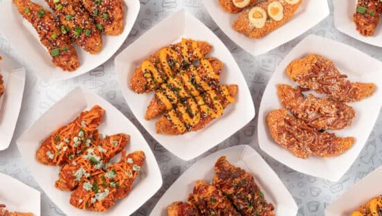
Food is as analog as you can get. It relies on a physical interaction—touch, taste, smell, etc. (Thankfully, there’s still plenty of time before we’re downloading sustenance straight from an app.) Through marketing and design, you’re making promises that your food must fulfill. The eating experience is everything. And food is inherently a shareable thing—from having a meal together with family and friends, to sharing pictures of your food on Instagram. So you want people to be sharing your food for the right reasons.
Packaging is the other important component of analog. Simple, but not boring. Distinctive, but not distracting. And more than ever before, it has to be responsible. We believe in treating packaging—especially in the quick-service restaurant space — as a gift. It’s a bonus, a supporting element to enhance the dining experience. Devoid of traditional sales messaging. Don’t try to sell me something else when I’ve already bought into the brand. It’s another opportunity to bring a smile.
Turner Duckworth is known for its work on McDonald’s Happy Meal box design. Walk us through that project—where the inspiration came from and how it all came to life.
Though Happy Meal is a well-known and beloved icon around the world, it had been treated very inconsistently. We created a design system that encourages a sense of play, putting the iconic red box front and center throughout communications. We felt the visual identity should be as fun to work with as it is for consumers to experience.
The Happy Meal refresh started at the beginning of last year which, fortunately, coincided with Happy Meal’s 40th Anniversary. McDonald’s was planning to celebrate by re-releasing retro Happy Meal toys from the past four decades. We were able to use the event as a global unveiling of the new Happy Meal visual identity, looking to the past to inform its future.
Nostalgia plays a really big role for Happy Meal, so we decorated the box itself with vintage stickers relating to each toy. The stickers evoke childhood notebooks, school lockers, and all the other ways kids make something their own. The campaign continued through other supporting elements like posters and animations—all working together to generate worldwide intrigue and spark conversation around the event.
Happy Meal is evolving on more than just a surface level. As it continues to roll out worldwide, you’ll see new ways of addressing kids’ nutrition, more dynamic engagement with partner brands, a larger focus on books and reading initiatives, toy recycling, and more.
As we all see throughout the industry, thanks to delivery and convenience, actual restaurant spaces are getting smaller and smaller. And people move through the unit quicker, especially if they’re ordering digitally and just picking up. As an operator, how do you make an impact with those hurdles in front of you?
This is a classic design challenge—minimum space, maximum impact. It means each touchpoint has to work even harder than before. More focused. More distinctive. It’s an exercise in distillation and pacing. Don’t fall into the trap of trying to say everything all at once, which leads to saying nothing at all.