
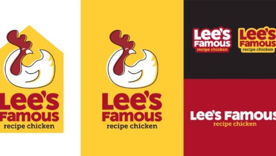

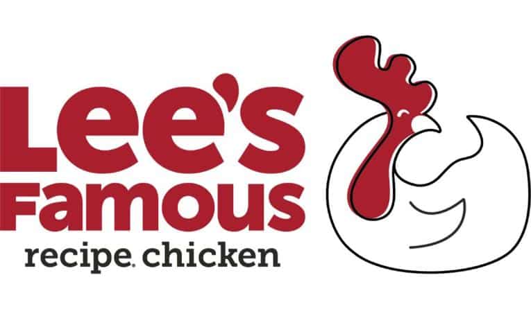
After more than 55 years in business, Lee’s Famous Recipe Chicken is refreshing its legacy brand with an updated look and feel. The 130-unit chain has a new logo “reflective of key components of the brand” as well as a fresh icon. These elements went live on Lee’s app, website, and social media, and will soon be implemented on store signage, uniforms, and packaging.
Lee’s worked with Chute Gerdeman on the project. The agency has worked with Krispy Kreme and Starbucks over the years and conducted research on Lee’s, visiting dozens of stores, to better understand the chain and how customers view it. “We love working with legacy brands to reinvigorate and grow their concepts,” Brian Seitz, partner, design + strategy at Chute Gerdeman, said in a statement. “I grew up with the Lee’s brand and enjoyed going there with my family. I am incredibly happy and proud to help this legacy brand move forward and so happy with what our two teams have created to build on the key components of the company.”
Lee’s new branding conveys the company’s focus on having customers feel cared for throughout their Lee’s experience, it said, while remaining true to the heritage with its traditional red and yellow colors. The creative team drew inspiration from the Lee’s core values for the refresh: Heritage, Care, Quality, Comfort, and Traditions.
“We are excited at how this work strikes a balance of being bold and modern while not straying too far from Lee’s history,” Dan Sokolik, VP of marketing, said in a statement. “It was important for us to keep elements like our recognizable brand colors and the focus on our Famous Recipe.”
The project also took a fresh spin on Lee’s brand voice. The company, with help of its new icon, will spotlight a playful, friendly, and inviting approach. Key elements include being Enthusiastic and Passionate; Playful, Friendly and Conversational; Trustworthy and Confident.
QSR chatted with CEO Ryan Weaver and Sokolik about the brand refresh, what to expect, where the inspiration stemmed from, and how Lee’s plans to balance modern with legacy as it readies for its next act.
Take us to the beginning of the project. What was Lee’s hoping to accomplish with the new branding, and why was this a good time to dive in?
Weaver: Our brand has been around for almost six decades, and that heritage is a core part of our identity and who we are. We’ve been serving the best hand-breaded, honey-dipped, and fresh-never-frozen chicken since then, and still are today. Our restaurants have been open and operating for over 35 years on average, which speaks to the brand’s strength, but it also means many of our restaurants are due for a bit of a facelift. In thinking about reimaging and refreshing our restaurants, we thought it was time we did the same with our logo. The timing couldn’t have been more relevant as we continue our journey of reigniting growth and new franchise development for Lee’s.
How does the refresh modernize the brand and stay true to its legacy roots? How challenging of a task is that as a marketer?
Weaver: We wanted to modernize our look without making such drastic changes that our customers wouldn’t recognize us. We didn’t want to change the name of the concept at all; we didn’t want to change our iconic colors at all. But, I think the result here really hit the bullseye of making the wordmark and new logo more modern and inviting, better representing our fresh food and friendly service that our customers know us for. The biggest challenge was to resist the urge to stray too far away from a look that we all agree needs to be updated but is familiar to our consumers. Embarking on a project like this to refresh our brand, there’s a desire to rip up the past and start over. The reality is that whatever we came up with would have to work in tandem with our old logo for some time at the restaurant level. So, we needed a look that felt modern and fresh but would fit in with how our restaurants look today, and I think we’ve accomplished that.

What are some other activations we can expect from the brand as this all comes to life?
Weaver: You will start seeing this new look everywhere, albeit not all at once overnight. We’re starting with rebranding our digital assets, like our website and loyalty app, then moving to our uniforms and packaging, and finally to the physical restaurants themselves. Any new restaurants we or franchisees open from here on out will also feature this new look and branding. The logo is the most significant piece of this, but as we finish up work on our new store design prototype, even more of the new branding will come to life with areas in-store that will focus on the brand’s heritage and our ties to our employees and the communities that we serve.
Break down the new logo. What are we looking at?
Sokolik: One of the most significant differences between our old and new logo is that we can now break out of the constraints of the rectangle shape that defined our old look. Our new branding allows us to use different logo variations depending on the circumstance. We now have vertical and horizontal options, with or without another big change for us, adding a brand icon. Previously our branding only consisted of our restaurant name; now, we have a visual (and soon-to-become recognizable) icon that reminds people at a glance what Lee’s Famous Recipe Chicken is all about.
Talk about the new voice and what it signals for Lee’s direction.
Sokolik: At Lee’s, recognizing our past is integral to our brand and who we are. So, we’ll continue to celebrate our unique heritage, drawing even more attention to our founder himself, Mr. Lee Cummings, and his famous fried chicken background. But as we look at how we communicate with our guests, we’ll continue to strive to sound Enthusiastic and Passionate but not too serious. Playful, Friendly & Conversational, but not irreverent or cheesy, and Trustworthy & Confident but not too formal. We hope that consumers will recognize with our visual changes, along with this tone in brand voice, that we are making efforts to revitalize this historic brand.