
It’s common knowledge in retail industries: image is everything. And when it comes to an ever-evolving market like quick service, operators are finding that it’s more vital than ever to keep their image fresh, lest they get left behind and become outdated.
The trick to keeping a brand image up to date, experts say, is knowing when to update and doing so without losing the fundamental concept of the company. A brand image can be portrayed through logos, store designs, menuboards, graphics, and even packaging.
But in a still-struggling economy, frequently investing in all of these components can seem a staggering endeavor.
“What you want to avoid is actually ever becoming dated. You want to just stay one step ahead of the curve so that you’re always fresh,” says Tré Musco, chief creative officer at Tesser, adding that store renovations should be made about every seven years.
Tesser, a San Francisco–based brand strategy and design agency, has redesigned logos, store concepts, and other image components for clients like Domino’s Pizza, Del Taco, KFC, Quiznos, Dairy Queen, and Popeyes. Last year, Tesser worked with Wendy’s and created four new store designs, including an ultra-modern model that emphasizes sleek finishes.
Tesser also updated Wendy’s logo for the first time in almost 30 years, a change that will roll out this March.
“You really have to strike the fine balance between moving [the logos] forward, but also not moving them away from what people love about them,” Musco says.
“For Wendy’s, [people] love the idea that the restaurant is named after Dave Thomas’s daughter; they love that there’s a real person behind the brand, it’s not a made-up character, for example,” he continues. “So we really wanted to amplify the realness and the wholesomeness of that idea.”
The redesigned logo is a more realistic and authentic version of Wendy, with clearer facial features and a more modern outfit. The taglines “Quality is Our Recipe” and “Old Fashioned Hamburgers” were removed from the logo and could potentially be added to the storefronts in a larger font. This simplified and amplified the logo, a philosophy Tesser tries to follow for all redesigns, Musco says.
The word Wendy’s is revamped in a signature-style font to emphasize the personal nature of the brand, he adds.
“Logos really are the longest-lasting brand asset, besides the name,” Musco says. “Most of our clients have them 20 years, 15 years, or 30 years, and so you really want to make sure that it is properly done and will stand the test of time.”
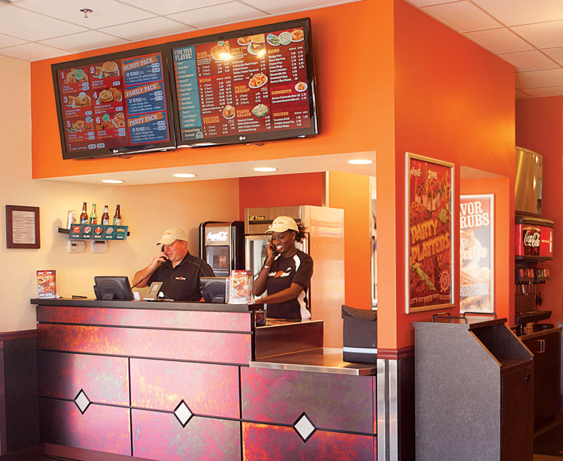
For Wing Zone’s CEO and cofounder Matt Friedman, contemporizing his brand’s image involves more than just a logo refresh. It also includes changing Wing Zone’s primary ordering format from delivery to dine-in and takeout. This in turn forced Friedman and his team to contemporize the in-store design to attract customers.
“The direction of the company moving forward is nondelivery … and, because of that, the branding and the image and everything we do inside the store became that much more important,” Friedman says.
Last September, Wing Zone opened its first nondelivery, drive-thru concept in Smyrna, Georgia, which Friedman says is the first of many to come. This flagship restaurant, along with additional recently renovated Wing Zone units, contains new wall graphics, modernized floor tiles, digital menuboards, and a new color scheme that shifts from yellow to orange, all designed around a focus on flavor branding.
Friedman says Wing Zone’s focus has always been flavor, but it wasn’t defined until two years ago, when the new branding strategy began.
“I think a brand needs to define what they are in a few words, or maybe a sentence, or maybe one word,” he says. “And I think [flavor] defines us very well.”
Friedman says operators should be conscious of the costs needed to refresh a brand’s image, particularly since franchisees are involved. He thinks major changes to a brand’s image should be made every 10–15 yea rs.
“It’s exciting to take on new challenges and have to connect the way the stores look and feel and operate,” Friedman says. “I think we’ve done it in a very economical way. The cost to open a new Wing Zone today, because of the new branding, is really no different than it was two years ago.”
Dan DiZio, CEO and cofounder of Philadelphia-based Philly Pretzel Factory, refreshed his concept’s image through a new kiosk format, as well as by innovating the logo and adding new LCD-TV menuboards.
The new kiosk is smaller than traditional store formats, enabling Philly Pretzel Factory to set up shop in a wider range of area—such as airports, amusement parks, and malls—for a lower cost.
DiZio anticipates having around 60 percent kiosks and 40 percent traditional stores in the future.
Previously, he says his stores used a plain and outdated design. Now, Philly Pretzel Factory stores still use portions of the brand’s original finishes, but the company has updated its image through elements like fresh countertops, under-counter lighting, and improved signage.
“As time goes on, we keep upping the level, and every time we do another store, we add something to it that we really like and make that a signature part of what we want to continue on doing,” DiZio says. “We don’t want to lose the message that we hand-twist and we have fresh pretzels at all these locations … so we keep that in there, as well as the old colors and image, but also bring it up to date.”
He says updating a store doesn’t have to be expensive.
“It would be great to change every year, and there’s always going to be evolution, but I think a dramatic change every five to six years, a rejuvenation of the whole image, seems to be on par,” Dizio says. “I think it can be done functionally. We don’t have to destroy a store. … We can just freshen up.”