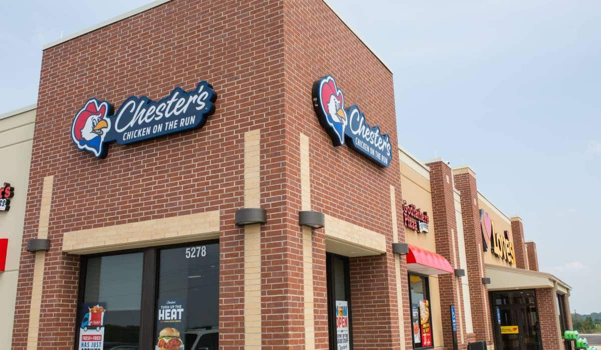
At Chester’s Chicken, things can get a bit messy. Guests might hear oil splattering. Flour might be on an employee’s apron. But that mess is a cue of freshness to the guest, VP of Marketing William Culpepper says.
And it’s a differentiator Chester’s plans to build on with its new redesign debuting this month.
“We wanted to lean into the fact that we are hand breading and frying fresh chicken in our stores every day, which we think is a major point of differentiation,” Culpepper says. “It’s going to be a little bit messy, but it will also be delicious.”
The redesign reflects changing times with a red, white, blue, and yellow color palette, updated menu boards, and modern architectural and interior brand elements. Chester’s brought the updates to life with the help of brand experience and architecture firm Nelson Worldwide, which has also completed work for Google, Yum! Brands, Disney, and Target.
“It was just time for us to up our game and create a much more upscale experience and more modern experience for our guests so we could stand out in what’s becoming a very competitive market,” Culpepper says.
Since the last refresh in the early 2000s, the brand’s core aesthetic has remained largely the same, but the industry hasn’t.
Chester’s, a chicken chain with more than 1,200 units primarily in convenience stores, supermarkets, and travel centers, watched as more non-traditional locations brought in quick-service competition.
“We’re not competing against roller grill hot dogs and freezer to fryer burritos like if we were in the 1990s,” Culpepper says. “Now we’re competing against a lot of the big name [quick-service restaurant] players who are starting to move into convenience stores and travel stops.”
The Durant, Oklahoma, location based in a Love’s Travel Shop first unveiled the redesign in August. Recently opened stores in Monroe, Louisiana, and Elk Grove Village, Illinois, showcased the new design, too.
Culpepper says the core of Chester’s is still the same, yet with a bolder, cleaner, and more modern expression. The redesign built on the chain’s established brand, and notably, Chester, the chicken mascot.
“We just sort of simplified and honed in on what really makes people gravitate to Chester, which is his smile and his eyes,” Culpepper says. “He’s just got this really welcoming personality.”
Chester’s design was built to be highly adaptive and flexible because of the chain’s longstanding tradition of going into existing spaces. But with the rebrand, Chester’s wanted to design a restaurant from the ground up with every aspect specially chosen—from paint colors and light fixtures to wall and floor tiles.
Since opening the redesigned stores, both the franchisee and customer community seem to love it, and the topline response has been positive, Culpepper says.
[image source_ID=”130560″][image source_ID=”130559″] [image source_ID=”130557″]
The redesign fits with Chester’s recent digital refresh, which began in 2020 and features a new website, improved training tools for franchisees, a simplified logo, new packaging, and a newly constructed digital menu board. With the website in particular, the prior version maintained a business-to-business message about franchising. But now, the website appeals to customers with elevated fried chicken photography.
“I think we’ve got a really loyal, almost cult following for Chester’s,” Culpepper says. “We want to build on that and grow, and I think that’s what the website was really designed to do, lean into the BTC [business to consumer] message.”
The redesign can also be utilized as a tool to stimulate franchise growth, including the modular kitchen, which can be resized to fit any space.
“Everyone’s looking for a way to grow margins, and it’s very competitive out there,” Culpepper says. “So you have to have something new and fresh.”
Chester’s new store designs were already underway when the pandemic hit about a year and a half ago.
COVID forced the brand to take a step back and reassess, especially with the lack of traffic to travel centers.
“Our whole world has been shaken a little bit,” Culpepper says. “We did not sit idle. We went back and looked at every training material—every piece of training material that we’ve ever created—and asked ourselves the question of are we doing this process right? What can we do differently?”
Chester’s forged ahead, with much help coming from convenience stores and supermarkets that’ve thrived since the earliest of business shutdowns.
The company still adjusted some of its business strategy, such as placing a greater emphasis on grab-and-go options. By launching a lineup of chicken sandwiches (and sparking its entrance into the chicken sandwich wars), the chain added to its repository of products it could easily wrap.
This allowed Chester’s to be in different areas of the store, like near a cash register, meaning more potential customers would see its products. This move brought a lot of traction, Culpepper says.
Moving toward grab-and-go also helped on the labor front, which is still quite the challenge for Chester’s since the brand relies on workers to hand-bread and fry chicken each day. But optimism remains as the brand plans to open five more updated locations in Love’s buildings by the end of 2021. The company continues to look for growth opportunities in convenience stores and supermarkets as well as other nontraditional channels like ghost kitchens, college campuses, and airports.
More menu innovation is on the horizon, as well. Chester’s will roll out new mac and cheese, green beans, and mashed potatoes sides, with other new product initiatives coming soon.
All new stores will have Chester’s brand refresh, and franchisees will update counter graphics, menu boards, and put up new exteriors by 2024.
With locations in 48 states, Culpepper says Chester’s is open to any region, depending on the best opportunity with the right partner.
The brand’s goals are clear: keep delivering delicious food in surprising places and continuously improve.
“We believe highly in our product and we just want to keep getting better,” Culpepper says


