In the increasingly competitive fast-casual world, keeping up to date does not just mean adding fresh offerings to your menu. It means refreshing your look to keep pace with current trends. As many fast-casual chains of different sizes are discovering, tweaking their design can be a way to attract new customers and build upon the success and message of a brand, taking it to the next stage.
Established in Austin, Texas, in 2011, Verts Mediterranean Grill (originally the “Berlin-inspired” VertsKebap) underwent a change timed with the move of their headquarters to New York City. Now called Noon Mediterranean, the 19-unit chain now has two locations in Manhattan. The original name Verts was wordplay on vertical and also means green in French, but the company learned that it was hard for people to pronounce and that people did not associate with it. During the yearlong period that Verts made its branding transition, they told the agency they hired, Gin Lane (who helped develop fast casual icon Sweetgreen) that a name change was not a specific part of the makeover. During the process, however, their people at Gin Lane brought up the idea of testing the waters with a new name.
“We said, ‘We’re not married to the name but it’s hard to change direction while you’re fully running,’” co-founder Michael Heyne says. “But when we started to explore that, we knew we needed to change the name, no matter how hard it is in the short-term. We found the [new] name is really incredible for us because it means lunch—it’s witty, symmetric, short, looks really cool, and means bread in Farsi. It has a slightly Middle Eastern connotation, but it’s not too Middle Eastern. In a way it is exactly the balance we want to find with our millennial brand because we’re not playing Arabic music in the restaurant.”
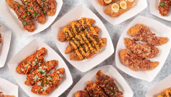
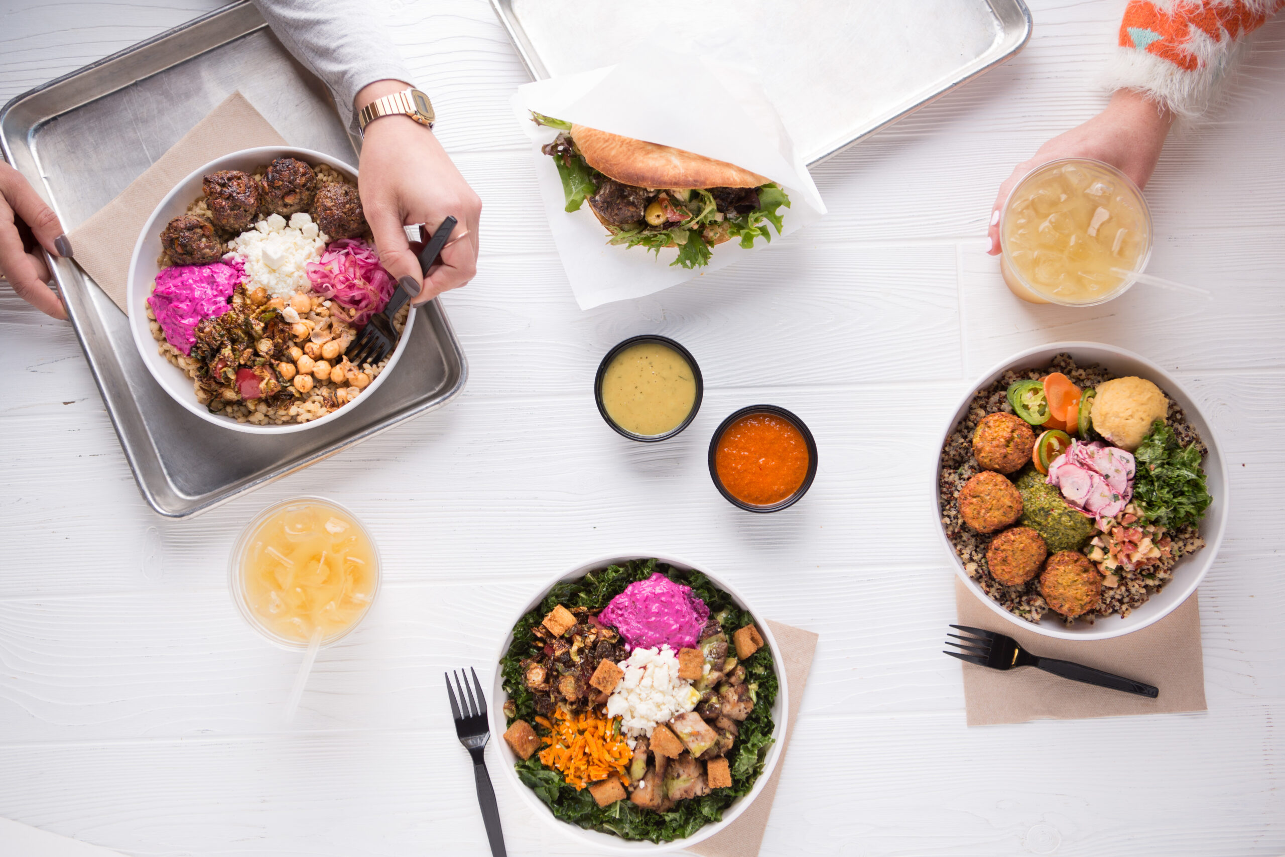
Over a two-year span that was not specifically tied into the rebranding, Noon’s cuisine became more Mediterranean-based, which meant they needed hummus, tahini sauce, falafel, and other ingredients associated with that. They expanded their offerings and evolved some menu items. They focused on increased freshness and quality. They also have a seasonal menu to test out new items. Heyne says they are hearing more and more positive feedback, and while he loves Texas, the move to New York has helped the chain to stay plugged into up-to-the-minute food trends.
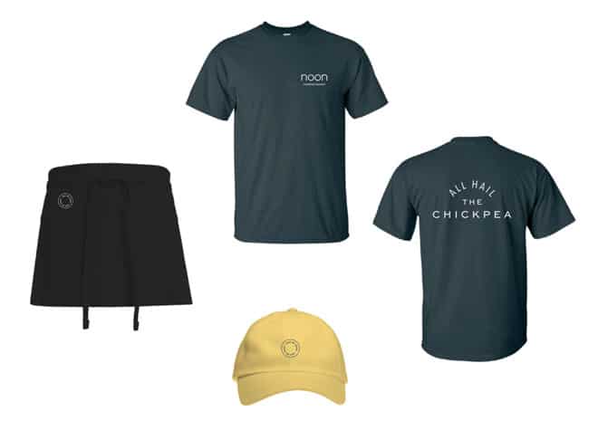
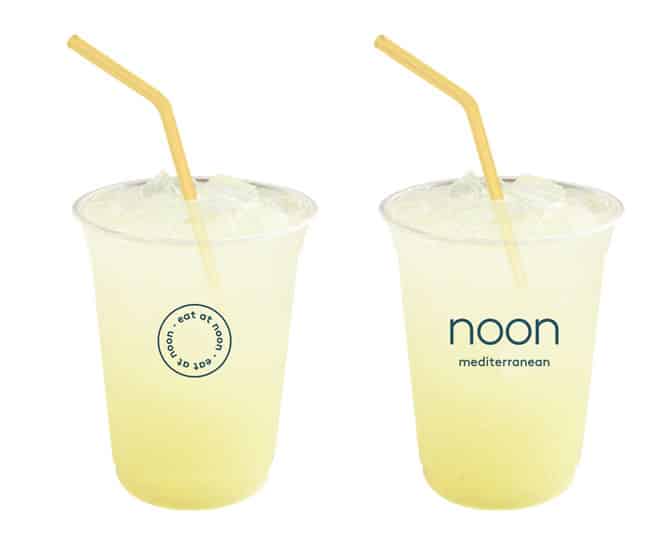
Noon also has a completely new color scheme. “The old brand was red, which is a color that is used with food but not a very modern or millennial color,” Heyne says. “Now it’s emerald green and yellow. It’s hard to find those two colors. Sweet Cream is a dark green and we don’t want to copy them, and Cava has a yellow and orange. If you use an orange or yellow alone, it looks like a bakery. And blue alone is not appealing, but both together create a combination that is unique and we can build an identity base off of.”
Similarly, under the auspices of Paul Damico and through the help of Sterling-Rice Group in Boulder, Colorado, the 38-unit Naf Naf Grill transformed into Naf Naf Middle Eastern Grill, narrowing the focus on their cuisine from generally Mediterranean to specifically Middle Eastern, something that he felt they could do well. Along with the culinary shift came other changes—to a fresh logo, color palette, uniforms, and materials reflecting those changes, like disposables and paper goods.
“It’s almost a whole new rebirth of this brand, which has been so successful over the last nine years,” Damico told QSR. “We’re putting a whole new level of energy and talent around this in preparation for our franchising efforts. We’re that ready to start doing this.” This coinciding with increased investment in the company and chain expansion plans.
Pizza Patron, a 90-unit chain out of San Antonio, Texas, is another brand that recently unveiled a new look in preparation for growth.
The chain switched up its color scheme and unveiled a new logo executives felt better represented its heritage and direction.
“In order to stay attuned to the ever-changing needs and interests of our consumers, we knew the importance of the need to constantly evolve in order to stay ahead of the competition,” the chain said. Read more about the transformation here.
Rebranding mid-stream can throw some customers offer, as Heyne discovered. “Of course the people in Texas that have gone to Verts over the last few years have complained,” he says. “Some have complained that in a nonconstructive way, but others eat the new food and think it’s really cool. What’s really important is that we have brand recognition in Texas in our target group of maybe 10 percent. What’s really exciting is now what can this new brand do with the other 90 percent?”
Another important aspect to a design upgrade is the digital side of things, which is where a company like RepEquity comes in. “Our company came out of the digital marketing and brand background,” says Tripp Donnelly, CEO of RepEquity. He says their key players “came out of understanding the aspects of consumer behavior online, lifestyle consumer behavior, and how people bought online.” Many of the design elements that they focus on for building brands include customer acquisition, consumer behavior, search engine, social media, and other online elements. They have found their clients know that those are “an activation point for connecting that brand to audience would ultimately be through digital.”
Donnelly zeroes in on the fact that the combination of design and lifestyle would help connect customers through digital. He adds that when you walked into most of their clients’ chains today, “even the infrastructure and technology elements that are alive within these restaurants are part of how we build brand. As you’ll notice, most of them are order ahead of time. It’s ease-of-use—they come in, pick up, and walk out. Even the technology they use in the restaurants now is much more efficient and lower cost and far more integrated into their mobile applications as opposed to big box, big hardware that you used to find even in small fast food restaurants.
“We’re seeing trends within the fast-casual market—visual trends, trends within menus, even trends within concepts—and it’s important to stay ahead of those things,” says Kenny Rufino, senior VP and creative director for RepEquity. “When a client comes to us, whether it’s a new concept or an established concept looking for a refresh, we have to get to the heart of what they’re trying to do. Some folks have fully fleshed business plans and some have a kernel of an idea. Regardless, it’s about getting to the heart of it and understanding it.”
Rufino believes that “a lot of fast casual interior design really needs to work with the core essence of the brand. How to be strong enough and be understood by everybody in the organization so that when it’s applied across—whether it’s manifested as a logo or as a chair or cutlery, or to something intangible to the sense of feeling you get within the space—they all need to support the pillars of the brand and what the personality of the brand is. Otherwise you’re going to have a disconnect. Consumers are savvy these days. They’re going to notice a disconnect and easily go somewhere else.”
He notes different types of groups one can find in terms of fast casual interior design—some are more rustic, some more industrial, some more minimal. In the case of the latter, “Sweetgreen is an example of how can you do warm, fresh, and welcoming while having a really clean, almost Scandinavian aesthetic,” he says. “They’ve managed the two quite well.”
“The work that we’ve done for Shouk is really interesting,” Rufino continues. “We wanted a bazaar feel. We wanted tactile items. We didn’t want Scandinavian minimalism. I hate to use the word raw—because with food that implies a completely different meaning—but we wanted [it] to feel like a real, live space, like you wandered into a market or a bazaar and you can sense the spice in the air.”
Rebranding needs can vary from a regional to national level and beyond, based up location size, and also the right moment. But there is not set formula for such a transformation. “I think that when a company is young, if you’ve still got a handful of locations you will have a greater flexibility if you do need to refresh,” Rufino says. “You’ve certainly got less things to update, versus rolling out an update over 40, 50, or 100 locations. There is no wrong time to do it. It’s understanding when the right time is. It’s listening to a lot of different things.”